The Sunmaid maiden gets a makeover
I don’t know about you, but I think this is an utter outrage.
Why mess with an icon that has stood the test of time? Oh, I know she’s been spruced up periodically in the past, but she’s always remained recognizably the same person (a person with whom, I might add, I identified—long dark curly hair, for example)—till now.
Here are the traditional Sunmaid raisin maidens:
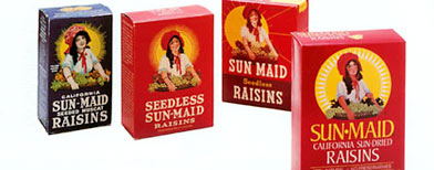
And here is the new Disneyfied version, her folksy blouse replaced by something that looks like spandex, her hair lightened from deep brunette to a honey brown and worked on slightly by one of those ceramic straightening devices, and the grape basket gone, the better to show off the attractions of her new streamlined torso:

[NOTE: When I was a child, I used to gaze at the Sunmaid raisin box and contemplate infinity. She carried that basket of grapes, after all, and for some reason I always imagined there was a box of Sunmaid raisins displayed there, too. On that raisin box there would be a drawing of the Sunmaid raisin girl carrying a platter of grapes and another Sunmaid box, and on that box there would be…….]
May this company die the death of the New Coke!
Mother for years put out ketchup in a dispenser bottle with a picture of a woman carrying a tray on her uplifted hand. There was clearly an identical ketchup dispenser bottle on that tray.
Undoubtedly it pictured that same woman, delivering her tray with ketchup bottle, which pictured… Not that the drawing’s resolution was sharp enough to actually confirm the same picture being repeated.
But there is a scientific consensus that the laws of infinity require the picture to be continued on each bottle. Only a denier would dispute that.
I agree totally. As a child I always loved her peasant blouse and wondered how she was strong enough to carry that huge basket and manage to still look cheerful while working so hard in the hot sun. Kids give stuff like this a lot of thought. 🙂
Now she just looks like Barbie, shame on Sun-Maid
Strange. I felt a sort of wistful longing for the sunny world the Sunmaid maid was depicted to inhabit.
But then I think I gazed too long at the little seal on a Campbell’s Soup cans.
Neo, the trend is for companies to make their logos ever less detailed, in order to make them easier and cheaper to print. (There may be other motives, but leave them aside for now.) The result, of course, is that they also become ever more bland and boring. The old logos had more human emotional appeal, while the new ones do not.
Another example: The original Captain Morgan paintings were done by a very talented artist named Don Maitz, but now they’re done by anonymous corporate drones producing bland mush to please soulless bean-counters. I’m sure you can come up with dozens of other examples.
As I live in raisin country, not far from the Sunmaid plant, I feel the loss of the beautiful old Sunmaid raisin maidens very keenly indeed.
Well, they’ve got to sell raisins.
I suggest, however that the new raisin maiden picture has a rather Soviet feel to it.
She looks like she goes to Joe Biden’s dentist. Creepy!
I agree w/PST314, and maybe AVI agrees also, that the girl is less human. She is more like a computer simulation of a human.
Also, as an unrepentant student of the female form: her breasts are wrong. You only have breasts like that if you are 16-17 years old, or if you are a competitive breast stroker and have built up the surrounding muscle (I know this, um, from personal dating experience).
Disturbingly, the new image is designed to be more sensually alluring. I’m offended. The company either wants me to pretend a woman’s breasts look like that, or the company wants me to be enticed by either a computer simulation or a 16 year old. Any way you cut it: offensive.
As a little boy, that lady on the box reminded me of my mother and aunts. I always thought of them when I ate them. Later, I gave them to my children also. Let’s hope they don’t mess with Laughing Cow cheese, my daughter loved the cow with the earrings, even more so than the Sun Maid lady!
She’s got the same goofy red hat (bonnet?) though.
“Additionally, there’s been talk that the new Sun-Maid girl might be given a name and featured in future advertisements doing some of the things modern women typically do, like going to the gym, shopping at the market, and speaking multiple languages, particularly languages native to countries where Sun-Maid, the world’s largest producer and processor of raisins and other dried fruits, sells raisins. However, the image on all Sun-Maid product packaging will remain the same, as the new version will only be featured in product advertisements.”
It’s not quite the end of the world!
Greetings: especially “pst314”
As an escaped printer, I would like to say that there would be no difference in the printing costs. More likely, the CEO’s son currently fancies himself a graphic designer and the old man was up for a little financial nepotism.
I will miss the old style’s more earthy, European, legal immigrant mode, but as to the change overall, I think it’s right up there with programmable coffeemakers and rain-sensitive windshield wipers on the “Problems that don’t need to be solved” list.
Why mess with an icon that has stood the test of time?
because with no actual measure of better made through a judgement, the system changes.
in a world where there are absolutes, and everything is not relative, you can find a best way to do something.. and you can conserve it as best and measure it against other things and refine things over time… thats meritocratic progress.
ah.. but when you lose the faculty to make that comparison again, then you are on a random walk. you have no way to know which is better.. so now the game changes and what you are doing is choosing stagnation or change… and since stagnation doesnt sound like progress, change takes the place of measured and meritocratic progress.
and all this stems from a problem which isnt a problem for people who dont think about it and act on it. 🙂
that is, nihilism and lifes lack of meaning isnt a problem if its not pointed out and we are left alone to meander. progress is then measured by life and we dont care or even notice that to a limited self appointed genius, its meaningless.
which is a real kick if you can grasp it.
its even worse for those charged with making progress happen! they cant even define it. just as the same people cant define value.
lets just say that looking around and noticing something that hasnt changed is how we make progress now. (the unsettled and bored house frau’s idea of progress… rearange the furniture)
ah there is an infinite goof and a bloody good rub in all this… because progress can only be made by not directing it.
its similar to trying not to think of polar bears making you think of polar bears as you have to think of polar bears to check that your not thinking of polar bears.
what you chase can not be held, tamed, controlled, or captured. but when you sit down, and your not thinking, you find that its sitting next to you. for progress doesnt really exist untill the parts that make it come into existence
“As an escaped printer, I would like to say that there would be no difference in the printing costs.”
As someone with NO professional experience in printing, I’d like to thank you for adding your two cents, and to ask what factors you think might be at play.
(BTW, I was under the impression that precision of registration was more critical with finely detailed images, lest the image look jarringly wrong, as well as other factors.)
11B40: I work in a printing shop, and you’re absolutely right. Both illustrations have to be printed as four-color process, so there is no difference whatsoever once the job is on the press.
pst314: You’ve got a point regarding registration of colors, but I don’t think that’s much of an issue with modern high-end presses. Anyway, the tolerances for printing raisin packaging aren’t as critical as they would be for magazines or art books.
(Full disclosure: My printing shop doesn’t have presses like that. 🙁 )
you refer to it as Disneyfied…
tDisneywould say “Re-imagineered”
http://www.sunmaid.com/en/about/sunmaid_girl.html
“Lorraine Collet posed for a painting with a basket of grapes” to give the series of packages.
its interesting that they have not yet updated their history to reflect their change in beliefs
The classic “Sun-Maid Girl” trademark has been modernized and changed several times through the years but has always stayed true to the original image of Lorraine Collett that has been trusted and cherished by consumers around the world for generations.
it will be interesting to save that page and see what they come up with as to the cherished something that they decided they dont cherish.
then Sun-Maid Classic at a higher price will come out… 🙂
I just looked at the Sun-Maid website, and the original 1916 version is definitely the best. Yowza!
Newer is not necessarily or automatically better. I wish more people would realize that. To me, it doesn’t seem like a difficult concept to grasp. Maybe I’m just an old fogey after all.
“then Sun-Maid Classic at a higher price will come out…” :-O
“I don’t think that’s much of an issue with modern high-end presses.”
There’s always the explanation that Harlan Ellison has given: Executives pee on anything in the least bit creative. After they’ve peed on it they like the flavor better and buy it.
She looks like Marlo Thomas in the old TV series “That Girl”
Gag…they turned her into an ‘avatar’ with perky boobs.
Next year, it will be Barbie Sun Maiden.
I suggest, however that the new raisin maiden picture has a rather Soviet feel to it.
socialist realism… the nihilistic art of the soviets.
we have copied and repeated a lot of it and celebrated copies as if originals.
however last night i took a long look through a lot of soviet era prints, posters, and such. she does not match anything in that or those images unless you stretch.. (the bonnet, becomes a headscarf, and is knoted a certain way… not there).
short of saying they removed the aura around her so its reserved for the one… i cant see any direct relationship.
at least if anything, this says i dont see soviets in all the shadows. i would say that they were influences by the styles (some of it is very strong and can be very appealling if it wasnt for the hell hidden behind it), but not the way the man who did the obama art and such was interested.
they converted what to many looked like a short spanish migrant farm worker, and made her into Adela Noriega with an oversized bonnet…
she now has the tall thin ‘im not pregnant stomach’ of western sexualized ideals. which parallel the the greeks and romans in their concepts of bi sexual asexuality.
she also works less… where the previous women worked, she only holds up her find as if she was shopping. she has been made more cartoon like to appeal to children whose best friends are cartoon characters as they dont live in a social neighborhood (how can they with the moms out? the shorter term temporary transitory arrangements dont allow for any real such integration. so they align with the most stable.. and mom and dad arent there… nanny or day care shifts… babysitters change… but through it all their friends on tv stayed… is it any wonder they live through the box?)
Like cereal cartoons, her eyes look like they are looking at you. but since she is made to appeal to both children and adults, she doesnt assume a position in shelf space. (once you notice things like this walking down a shopping isle can feel creepy)
she also represents the changing of woman herself, from workmate and helpmeet, to…
do we really have nostaligia for raisen images, or are we aesthete’s, who really think that the design was made in a fishbowl by someone who has no ties to any culture, and so just slaps things together in a way that assembles objects but drains their meaning?
im going back to my coffee.. 🙂
Artwork gets simpler not for all the conspiratorial/snobbish reasons speculated here. Art is simplified to make it more legible. The effort may not always succeed, but the point of advertising graphics is communication.
The potential market for raisins is vastly different today than 1906. The culture in which raisins are sold is vastly different. The new Maid reflects today’s world.
Not everyone has had a lifelong relationship with a raisin box. Many customers may not know the brand, speak English, or even be aware of what’s in the box.
The old version highlights the Maid. It might be a box of laundry starch or hair conditioner. The new version highlights the grapes (innuendo acknowledged).
It is now much more clearly a box containing something natural and healthful. The new Maid looks like modern people (although characitured). The old Maid looks like a childhood photo of someone’s great-grandmother.
I write this without having visited the Sun Maid site. I imagine there is an explanation much like this there, or extant in corporate-to-designer emails.
Check out the history of Betty Crocker, too. She went from being a grandmother to a young mom, and now she’s a spoon.
It seems to me that the changes are intended to make the figure easier to animate via computer. The “spandex” blouse, for example, can be treated as part of the torso. The straightened hair reduces the polygon count, and so on.
Pingback:Maggie's Farm
Well, she reminds me of Sarah Palin, which cheers me up a little. I imagine if the company thought that, they’d change her again. I still prefer the original Sun Maiden, tho.
I agree with 2Dave. The original image looks like a representation of a real person; the new one looks like a character from a low-end computer-animated kiddie show.
She’s gone from the Central Valley to the Uncanny Valley.
They’re giving a name to the Sun-Maid Raisin Maiden? I think they should call her Mary Ann, because she reminds me of Mary Ann from “Gilligan’s Island.”