Planning a new theme for the blog
Some time during the next month or so I hope to unveil a new blog theme (template). My goal is to avoid some of the glitches I’ve been having with the old one, but also to improve the way the blog works on smartphones and pads, and make the column of the text wider (some people have complained that on their browser or computer it’s too narrow).
This will take me a while, because there are so many themes to choose from and the conversion has to be fine-tuned. I need assistance from my trusty tech-helper, who does this for free and in his spare time. So I make no promises as to when it will happen (or even if it will happen), but my plan is within about a month.
In the meantime, here are some questions for you—
Do you think it would be good to have just the first couple of sentences of each post show on the main page, and then have to click to go to the body of the post?
Do you think it would be good to have little photos for each post on the main page?
I’m sure there are other decisions for me to make in regard to this, but I can’t think of them at the moment. Any suggestions you have are welcome.
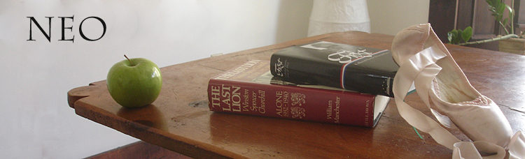
I want to keep the blog simple and clean, and I plan to keep the header photo of the books and the apple and the pointe shoes.
First couple of sentences then click I say no.
Little picture I say yes.
One thing I have seen other sites do that I like is have a most recent comment feature on the side which tells you what post is getting the most recent activity even it isn’t the most recent post. Too often posts get stomped on.
Please don’t go to the opening sentences then “Read more…” format. I always find that irritating. Thank you for asking our opinions on your proposed changes. It reflects your commitment to courteous discourse and debate that is one of the reasons why I read your blog.
Keep it simple and clean: don’t change it.
1. No on the “read more” style since it just adds to the load time. I think it is useful only when there are multiple authors and many posts per day.
2. No on the pictures since that just adds to your time looking for good pics, resizing them to fit the space, making sure they aren’t copyrighted, etc.
3. To simplify some things – see if the category and the archives widgets can be a drop down menu. And the blogroll could go up to the top as a separate page or thinned out. It’s a pain to keep checking links and the two I just checked out had last posts in 2016.
4. Having a widget that shows the last 5-10 posts would be ok.
5. Only request is to make sure there is sufficient boldness in the print vs the background. And, the font should be a clean one. Some of us are getting kinda old and need to get upgrades on the glasses!
No matter what – it is your blog and we will get used to whatever changes you make. We might growl for a few days, but we’ll still read you!
– Only first couple of sentences…
I guess that way you would put yourself under pressure to start every text with an interesting teaser. That makes it more complicated for you, but the text wouldn’t necessarily be better.
– Little pictures…
Where would you get them without violating rights? If you want to do that good it’s expensive and means extra work. The site would look more professional, but maybe not in a good way. There’s a good chance it would look less personal and more haphazard.
– Other decisions…
Blue suits you better then red…
first couple of sentences… only if it’s like AoSHQ where it opens up the remaining text. i find the opening up a new page (e.g., HotAir) time wasting, especially on the phone.
little pictures… cute but unnecessary
I’ll go with the flow if makes it an easier blog for you to post.
But get rid of the apple……..!!!!!!!!!
Richard
Pictures – not necessary. What’s the value added? I can’t think of much besides ‘everyone is doing it’.
Read more – I actually like the most recent change in “Read More’ used at the Belmont Club. I come here from feedly, so rarely go to the home page.
If I do have a link, I usually right click and open in a new tab. I typically have a gazillion tabs open and it slows everything down. I can’t explain why I do the things I do.
You didn’t ask, but PLEASE – NEVER – nested replies. The replies here are wonderful and I learn so much. But I never return for easy follow-up when there are nested replies.
Please, please don’t do the “have to click to go to the body of the post”! I’ve stopped reading some blogs because I dislike that kind of presentation. If there’s a post that doesn’t interest me at the moment, I’m perfectly content just to scroll past it.
I agree re the nested replies – please don’t do that since it makes it harder to go back and check everything.
Neo,
No to the “read more”. Same rationale as others.
No, to pictures. My PC is slow, and this might make it slower.
No, to losing the apple. I think it makes you look…I don’t know, mysterious. Plus, it’s a safety feature for you.
But I agree with the poster who said he’d keep coming to read regardless of what you do. Make it as easy for yourself.
I don’t know if this is possible, but perhaps an automatic email notification if someone responds to a comment you made.
Waidmann
I wouldn’t mind the brief intro and “Read More” on this site because:
1) I typically like to skim the comments and have to click through anyway.
2) More posts can show up on the first page, saving me from scrolling to next pages to find what I’m looking for.
3) On mobile it helps me navigate faster to what I want vs long scrolling pages to get to the next post.
I know that some blogs use that as a technique to display more advertising and keep people on site longer, which probably explains some aversion to this.
.
Photos on each post are interesting, but not necessary. So it depends on your goals.
It might attract more readers.
On the other hand, it would be more work for you.
Would rather you spend your time on writing than searching for photos – you already do include some interesting media links as appropriate.
Also, photos may affect loading time. This would impact your google ranking, if that is a concern.
.
What might be worth asking everyone is what sites do they like now for interaction, that you might model yours after – and it doesn’t have to be a political blog site either.
You might find that there may be a contradiction in preferences stated here on specific questions and what some actually like using.
Sussing this out is something of an art form itself.
.
One thing to add to the request list, is better/easier formatting for comments. I find it a challenge to make it easy to read and follow (hence the stand alone periods to space things out).
Some commenters are practically unreadable, perhaps because of formatting limitations, ease of use.
Don’t know if this is doable.
For those of us who use RSS to ready your blog, please don’t do anything that would change our ability to receive it as we do now.
I am confident that you will make wise choices. But thumbs down to “read more”.
Have a good Memorial Day extended weekend everyone and be sure to remember those who gave all. Daughter and family, including my oldest (14) grandchild, should be arriving in about an hour, so I will read the blog again late Monday. I hope everyone enjoys time with family and friends.
Do what works best for you and most of us will follow, I don’t mind a paragraph or two if it tells me who, what, when, where and why the way I was trained to write newspaper stories in the early 1960’s.
A bit of a photo from time to time is great if it adds to the story. But that’s just me and I have been reading you for a long time and will keep on with what works. Best of luck and thank you ever so much for my enjoyment of reading your posts each and every day.
I hate the “read more” buttons. I have come close to leaving Instapundit because of this. I hate to be teased. About some things.
Photos? They don’t add much. We come here because of the intellectual content.
I kind of like thumbs up and thumbs down on comments, but I suppose they’re a little juvenile.
Please, no read more. I always open those in new tabs so I can see the whole of the page.
No nested replies.
I find your column width to be just fine, also the font. I have old, watery, astigmatic eyes and they can read it just fine. At least before 8 PM.
Thanks, I value your work and link it fairly often.
Honestly? I wouldn’t change anything. I do understand the complaint about sites in the “blogroll” that are all but defunct, but personally that doesn’t bother me. A site that’s really dead is generally easy to recognize; then one doesn’t visit again, except perhaps on a research trip. This last is the reason not to drop them.
I suppose if you wanted to spend the time, you could check each site for death signs, and list the dead ones separately….
For heaven’s sake, DO NOT abandon M. Magritte ! That image was a brilliant idea, and it’s so effective both aesthetically and symbolically. And to top it all off, it’s very witty.
.
And thank you, neo, for your weblog. It’s a very, very good one.
I like simple and fast. This guy always has a nice design: http://kottke.org
So this, but with comments as you have them now. I think everything you have on the side could easily go into menus with no big downside. Even donate. A design like this makes the phone, tablet and PC views essentially the same, but the text is large enough on all. I also agree with the majority here that the read more is an irritating and unnecessary step.
Regarding donate, have you considered patreon? It seems half the podcasts I listen to recently use it.
Oh, I forgot images. I definitely wouldn’t commit to an image a post. It can become a disincentive to write. Only use images if you are inspired to do so by the subject matter.
– Other decisions:
Nested replies, reddit style, would be nice.
“Click through to read” is a pain. Whatever you choose, please make it easy to read. The trend is toward narrow, gray fonts, many of which don’t respond to double-click or stretch to enlarge. My eyes aren’t getting any younger.
1. No, because that format is best if you are posting multiple times a day like Instapundit.
2. No, that kind of stuff is categorized as “dancing baloney”.
Do enjoy the varied content of the blog. Thanks.
Expanding:
Please, no nesting. Please, keep high contrast between type and ground.
Please, keep “Preview” capability.
Please, no “Read more” or “Continue reading” stuff. Bad enough on a news-gathering site like Instapundit. Definitely not appropriate here — where it’s your own hard work that goes into the main posting. People get involved with what they’re reading, but the spell is often broken when they’re diverted from that even briefly and minimally. “Shall I bother?” runs quickly through the mind, and by the time it’s done so….
Agree that the present clean look is highly desirable — and much appreciated.
Please, no need for changes. If it ain’t broke …. Although of course it’s up to you, and a new outfit is always tempting and at least fun to consider.
(I believe Photobucket has a Creative Commons section, but I’d vote for No Photos, except when in your judgment they’re a distinct help in getting your point across.)
:>)
My two cents:
No, to the “click to read more”
No, to the “nested replies”
Yes, to the continued fine writing!
Thank you for your blog – one place where I feel that I can get a truthful look at any news story.
Neo – much depends on your goal.
If catering to mobile users is important to you, the last thing a reader will want is to have to scroll through lengthy full articles to find the one they want to read – they will scroll thru a list (e.g. Google Play Newsstand).
Also, since you don’t seem to be seeking to run ads, the most annoying part of clicking through to read will be irrelevant.
Also, you can control how much there is “above the fold”… two lines? two paragraphs?
Almost every one of those links under your Blogroll operates in a way that gives just enough info on the article to determine if it is of interest, but not the whole thing.
Drudge is entirely a click to read process. Breitbart is much the same, but with only a couple lines of content.
Have people stopped using those sites?
One exception is Michelle Malkin – she has only one article in full on her front page, but lists the others to the right on desktop, below that article on mobile.
Your current audience is almost entirely desktop, I imagine, so they have the real estate to more easily navigate. But, you still have to click again anyway if you want to read the comments – not sure how many readers do this, but seems we have a regular set.
If you had a list of articles, and comments did come up with the article, probably not much of a difference from today.
So, up to you, and how long you want to carry on, as I do think more of your audience will eventually come from mobile, again, depending on who you are targeting.
Some interesting ideas here…
http://uxmyths.com/
Neo
I like the blog as it is now…
Unless you are posting links as “irons in the fire” does I prefer just words. I like the “Power Line’ theme. It gives me the author, subject, and a teaser to the topic, all of which I use in my decision to “read further” or pass. You are doing good work; Thank you.
There was a comment mentioning that having just a few lines might be more stressful to write those perfect lines than the rest of the post.
I will admit that there have been some posts that I’ll start scrolling past since the topic didn’t initially appeal to me. However, something else caught me – whether it was an embedded video, some words that caught my eye or whatever. I ended up returning to the top of the post to read all of it.
You have a nice variety of posts – serious political, art, funny stuff – it would horrible to have people skip past these posts.
Please continue to avoid using Facebook for the comments.
I like the site the way it is now.
I generally read every post, so the “read more” feature wouldn’t buy me anything. If people want to be able to skim more quickly, that might make sense. I don’t think it would bother me much to have to click to the next page.
I don’t like the trend toward photos for every story. They usually add nothing except confusion. The photos at Belmont Club annoy the heck out of me, they are useless at best, often puzzling, and sometimes annoying.
Like most above, please NO to the “read more” — I hate that on PJ media. Altho, posting there, too, with a read more might be good.
Fewer, better posts (altho 1+ per day) is a great format.
Mostly no on photos — a few and especially videos when relevant seems the right mix already. Spend more time finishing some old posts; or perhaps throwing some up as “unfinished ideas” — it might be interesting to see how your commenters add/ change the focus.
A resizable, wider column might be a bit better for us on desktops, but probably worse for mobiles unless it adjusted well.
20-50 comments seems a great range — enough for a wide range, yet not so many that they’re overwhelming.
I loved Norm Geras’s Normblog — did you ever get interviewed by him with 50 questions? Blogging has gotten more professional, much less fun — I’d like you to keep up the fun, but also get more cash/ exposure thru more professionalism.
Miles Kimball (Supply Side Liberal, ex-Mormon) often writes for Quartz. You (as Jean K?) writing more for other places would be good. Please keep your apple picture — but add a Jean picture, too; maybe in a youthful dancing tutu?
Funny I read you more than I read Michael Totten now…
Keep up great thinking and fine writing about it.
Tom G:
I wrote for PJ for about 10 years, first as neo-neocon and then as Jean Kaufman—I think about 70 or 80 articles altogether. Here are the Kaufman ones. When you search for the earlier ones I wrote as neo-neocon, for some reason other articles by other people come up first in the list (perhaps they mention me?) and then my articles (see this). I also have written online articles for the Weekly Standard, here. Also American Thinker, here.
PJ changed its editorial policy and isn’t interested anymore. The WS is probably still a possibility, as is American Thinker. One doesn’t do it for money; one does it for love. Lately I’ve just been too busy, but I may start up again.
By the way, the anti-photo anti “click for more” response here was overwhelming enough that I doubt I’ll do either of those regularly when I choose a new theme.