Update on the new blog
[BUMPED UP]
I still have it open for public viewing and comments.
At the moment, I’m keeping the “NEO” on the header photo as is, and keeping the comments non-nested. These are things I can always change in the future if needed—because now, as a result of my labors, I know how.
You’ll be happy to know that I managed to add some code (!!) that increased the font in the box where you compose comments. I, who am ordinarily extremely afraid of changing code, managed to do this with the help of the Weaver Support Forum (“Weaver” is the name of the theme I chose), which—unlike most support forums I’ve known—seems to feature people who (a) know what they’re talking about, and (b) actually answer in a timely fashion. Bravo on that, Weaver!
I also put a box around each post so that each one is delineated from the other. I don’t like the look; I think it spoils the simple lines of the blog. But I thought I’d leave it up there at least for today and get your opinions about it, pro or con. [UPDATE: and commenter “ambisinistral” kindly helped me eliminate the sides and top of the box and leave just a line on the bottom.]
Unfortunately, though, the “comment preview” plugin doesn’t seem compatible with the new theme and the new version. Although I tried a couple of other comment preview plugins, they were old and weren’t compatible either. But now that the blog has a nifty “comment edit” feature, I’m not sure anyone cares so much about the preview anymore. I’d rather have both, and I’ll keep trying, but it may not be possible.
Any other suggestions?
You should be able to style the box so the top, left and right borders are transparent. That way each comment will have a line under it to act as a delineator.
ambisinistral:
If you know how to do that with code, please let me know. The regular theme adjustments won’t let me do it. That’s exactly what I’d like, though.
Like him or not, Vox Day has a comment system where the comments are not nested, but rather are numbered. The newest comments and replies end at the bottom. You can reference a previous comment by number.
I dislike nested comments, as sites that are (very popular) only ever show replies for the first poster. Boring… Page down… load more…. page down. I’m done.
No sycophant I, but your commenters tend to be worth a read, as are your articles. Thanks for them, by the way!
cap:
I don’t think I have any way to number the comments.
Again, it would have to be by code. Do you happen to know code?
However, it’s easy under the present system to reference what comment you’re referring to. Just say the author and time. Or, alternatively, if you know HTML, you can link to it.
Yes =– I’ll look at it
The default type/font size is huge. Visually, I don’t care for it. That said, I will still be reading it. Not sure what it will look like in Feedly.
Tom Murin:
It’s not huge on my screen, not in any of my browsers. And it’s not huge on my cellphone, either.
I wonder why you’re getting such a huge font. What browser do you use? What sort of computer or cellphone? Maybe it’s your settings? You can set the font size for a smaller one, I think.
I also might try a different way to shorten the line lengths and take the font down a tiny bit. I’m still experimenting. But let me know the answers to those questions if you could.
Here it is …. in the style sheet look for
.post-area {
padding-bottom: 0px;
}
under padding-botton add
border-color: white white black white;
Not huge type. Very comfortable, and I am at 120% zoom at the moment.
ambisinistral:
Thanks, but here’s the problem.
I do not have access to the style sheet, at least all my efforts have been to no avail and I’m told it’s not accessible. I do have the ability to ADD CSS to it, however, to override it. Do you know how that would be done?
I changed the font of the comments box that way, and it was successful. The code to do that began:
#comment
And then it had further code in a bracket like this { } .
in your custom style sheet add:
.post-area {
border-color: white white black white;
}
in your custom style sheet add the following:
.post-area {
border-color: white white black white;
}
Ooops, sorry about the double comment
ambisinistral:
The border isn’t the default. The default is nothing around the posts. the border is given as an option in the theme customization. I didn’t have to add any code to make the border appear; just checked a box in the customization screen.
In order to put that code in that you suggest, should I remove the border first by unchecking the box? Thanks for the help!!
In the new blog, when you have an entry open to view comments, there does not seem to be any way to step forward or backward to the next or previous entry.
I am used to seeing in the comment view buttons of some sort to go to the NEXT or to the PREVIOUS entry. I use these buttons a lot.
I think this will override it — or you could remove the color from your border rule and add the
border-color: white white black white;
line to thE RULE WHERE YOUR CREATED THE BORDER
D’oh, stupid caps lock key
I’m actually liking the boxes, on my iPad at least. I think someone else mentioned preferring a sans serif font for the body (as is used for the old blog, and for the post footer stuff right now on the new blog too), and that’s my preference as well. Generally it all seems to be working pretty well though, and ultimately you get to pick. 🙂 Thanks for asking for the feedback!
Have all of you read the tweet from the high level Facebook executive saying that most of the Russian ads were made AFTER the election, they made that point specifically to the investigation team but the media intentionally ignored that important detail.
Dump the hairline around the posts. You don’t see hairlines at the edge of the text in books. There’s a reason for that. It’s unnecessary and ugly. Don’t even think about it. A major, major error.
ambisinistral:
You are a wizard! That code worked!!
Take a look. Thanks so much!
TomR Says:
February 17th, 2018 at 5:14 pm
In the new blog, when you have an entry open to view comments, there does not seem to be any way to step forward or backward to the next or previous entry.
I am used to seeing in the comment view buttons of some sort to go to the NEXT or to the PREVIOUS entry. I use these buttons a lot.
* * *
I vote for this.
vanderleun Says:
February 17th, 2018 at 8:37 pm
Dump the hairline around the posts.
* * *
Your eyes are better than mine; I had to go back and really look for it – a very light white line.
Maybe it’s an artifact like the ones you get when inserting tables in Word and then disabling the border lines?
On colors and text, however, I would like to note that the color intended to differentiate links from text (especially in comments) is very, very hard for me to distinguish.
It’s reasonably noticeable on the post itself (although dark red and black are still too close for my comfort).
Looking back at the “old” blog, maybe it’s due to the different colors of the background; at any rate, the red looks darker to me on the “new” blog than it does on this one.
The font is quite large, I’m using Google Chrome. When I use the back button to return to this site the font is normal sized again. I copied a few words into a word processing document, says the font size is 15 (and Droid Serif, whatever that is).
I agree that you don’t need the preview button now that you have an edit feature. It’s nice but not necessary.
Still takes a while for the comment to post. I think we’ll get used to this.
It is actually taking just as long for my comments to post here, so maybe this is a function of my computer or internet connection and not the site at all!
I like it. Clean look, a bit wider. I like the subtle breaks between posts. Are you going to use the other web address versus the neoneocon.com one?
I’m not fond of the boarders around part of the text and comments, but other than that I think it looks great.
I like getting rid of the blank margins and using a larget font. Maybe slightly smaller would be better.
Agree with Philu on comments. Kinda cluttered. Maybe dump the square and border around the commenter and leave around the comment body. Then close up the column a bit.
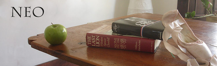
Larger NEO header photo looks great. I would like to see your photo redone without the hand.
I prefer a san serif font such as your current blog style. Otherwise, carry on!
Not going to be much help Neo. I like the new style, don’t have an opinion on comment style (nested or not). Everything looks great on my desktop, phone, and tablet. It appears more current and modern.
But now that the blog has a nifty “comment edit” feature, I’m not sure anyone cares so much about the preview anymore. I’d rather have both, and I’ll keep trying, but it may not be possible.
As long as you permit plenty of edits, yes. DISQUS has no previews, which means that you have to EDIT if you don’t like something you have written. Unfortunately, if you have more than one or two EDITs, DISQUS will send your comment to the Spam folder, where it will most likely die, as very few blogs actually check the folder for otherwise good comments.
I like your new sans serif font and font size.
I have used your blog to preview comments on other blogs that do not have the PREVIEW function.
I like or am neutral about most things on the new blog. One thing I don’t really care for is the top image covers the top half of my screen (I’m on a laptop.)
Also – your picture goes to the bottom of the page.
I like being able to start reading right away.
Julia:
That seems odd. It doesn’t do that for me at all. I’m wondering whether it has to do with your settings. What browser do you use–Chrome, Firefox, what? Do you have it in a very large format? Have you tried making the whole thing smaller and seeing how it displays?
It seems that you’re seeing it in something like the format for a cellphone, where the photo of me with the apple and the sidebar are pushed to the bottom. I’m not sure whether that’s what you’re describing, though.
Reading comments I looked at your new site and your old, back and forth a few times and the line length on the new might be a bit too long and the font size might be a bit big. In the long run, we will adjust and continue enjoying your postings. This stuff is not rocket surgery so it’s all good.
I don’t have time to examine the new format in detail, but will say that the new font is definitely too big for my taste. I don’t think it’s anything freakish in the browsers. Looks exactly the same in Opera (my usual) and Chrome, and typing a few lines into a word processing file in 16pt is about the same size. In other words, I clearly find 16pt to be too large. It results in less text on screen at any point. A matter of personal preference of course but the type size on the existing blog is fine for me, about optimal for the size-amount tradeoff.
Please do me the favor of changing the “opinionated” next to my blog name on the blogroll. I verify every single post with at least two in-country sources plus an English-language source. It’s not an “opinion” blog.
Neo:
At the newneo, my previously blocked comments have now appeared, so I was tempted into writing another comment. Still blocked. Has anyone else had this problem?
Cornflour:
They got unblocked because I found them and unblocked them. Sometimes, after that, the spam filter learns not to block someone. I’m sorry to hear the spam filter there hasn’t learned yet. I’ll keep unblocking them and then hopefully the problem will go away. Let me know if you continue to have problems.
Also, I got rid of comment preview because it wasn’t working and I thought maybe it’s the culprit. We’ll see.
Sorry for the delay in responding. I use Chrome on a desktop PC. 100 % setting. 20″ monitor. The type is significantly larger than the current blog and almost any other blog I read (when I click through from Feedly).
Tom Murin:
I haven’t been working on it in the last couple of days, but I intend to go back to it soon, and I will probably take the font size down a notch and narrow the column a bit to compensate. I’ll be experimenting with it.