More questions for you all about changes on the new blog format
Quite a few people requested a sans serif font. The theme doesn’t give me access to all fonts, but of the ones from which I had to choose, I selected what I think is the best sans serif font and put it up there. So, what do you think? Is it an improvement?
The line length got a bit longer when I changed the font, but not enough to cause a problem in my opinion. What do you think?
The font is 16, by the way, which is the recommended general font for webpages. Some people have said it’s really big for them, but I’m not sure why since that’s not the case when I look at it on my different modalities, including several browsers.
However, I noticed that (at least on my screen) it’s considerably darker in Firefox than in Chrome. Does anyone else get that effect? Is it too light or too dark when you view it, or is it more or less a good balance of dark and light?
I added links on post pages for forward and back to the next post or previous post, because some people thought that would be good. I used titles of posts rather than “previous” and “next,” because I think titles give you more information. What do you think?
After I have the blog content transferred, the old URL neoneocon.com will (hopefully!) redirect to thenewneo.com, so either URL should work to take you to the new blog. The old one will go into hibernation.
I haven’t been here in a while (sorry), but it looks great to me. I use Firefox and the lightness/darkness is fine….line length no problem, either. I’ll go hunting for the explanation of the changes – I always liked your writing, ever since Bookworm turned me on to it.
Cheers,
EARL
It’s me, again…..and NOW I have looked at the new site. It’s MUCH better than the old one, Neo! Like it a lot – although I’m using only a laptop. I find my flip-phone doesn’t do the Internet!
🙂
Congrats on the WordPress site….it’s looking great.
Initial thought on the font – stark and bold, but since I visit daily for the writing, its more of a “what do you want it to look like” not what I want feeling.
National Review just changed its website in a similar way — bigger font, increased vertical spacing — which spreads text out so much I find it harder to read in my semi-speed reading style.
It’s not a big problem. I can always feed the page into Evernote where it will be reformatted into more of a newspaper look.
I’m seeing this other places too. I’m guessing it’s mostly for the benefit of mobile devices.
Well, the new format looks fine to me. Of course, I was fine with your old format too. It (the new format) is clear and easy to read which, to my mind, is the main thing.
I like the new font.
I like it, seems to work.
The only critique to my eye is that the layout could use more white space between elements for visual rest and clarity. The beige sidebar here adds clarity and composition. Or a color bar instead of all black, or a thin line around the sidebar could break up the page.
On the new site, the bold copy, headline and sidebar are similar weight and contrast, and placed very evenly, so the page composition starts to blend and feel dense.
The large bold type of the copy is very legible, though maybe a bit big? But maybe that’s my device?
I may not be seeing your page entirely as you designed it as I have customized the display on all my devices with visual accessibility features to improve legibility for the hard of seeing 🙂 i.e. Type size, white point, boldness, contrast, (I prefer less because high black and white contrast gives me migraines.)
Anyway, I am a big fan and always look forward to reading your blog, regardless of design or type size.
For me, your present site is much easier and far more comfortable to read.
I’m I agree with Esther’s comments, as follows:
1. “The beige sidebar here adds clarity and composition.” Yes, and it’s much easier on the eyes than the all-white page. (Though on the other hand, thank the Great Frog you don’t have it all doodled up with images, crawls, running videos, whatnot all over the place.)
2. “…the bold copy, headline and sidebar are similar weight and contrast, and placed very evenly, so the page composition starts to blend and feel dense. ”
3. High contrast, very good (hate pale grey on white!); ultra-high contrast, very bad. I sometimes have to turn down the brightness to the point where the whole page is twilight-colored — including the print. :>(
4. And I too am a fan! Thanks for your forum and all your writing, Neo.
I probably can make the margins around the blog a bit more contrasting, hopefully in a subtle way. Although I think that I prefer a cleaner, smoother look. I’ll experiment, though.
Don’t give up your green apple avatar
I like the new look. Easier for my fading eyes to see. I like, like, like the like button. I also like nested comments but that format is not that big a deal for me. Will miss the preview button, but can also deal with it now that you have the edit feature.
All-in-all I think it’s going to be a better look, but that’s not why I’m a daily reader. It’s the writing and subject matter. That would be a winner in any format.
I like the new font and sizing. It looks good in Firefox on a laptop and good on a Kindle.
FYI – if I read in landscape mode, I see your blog as it is set up with the right side bar. The text takes up the entire kindle, so there is no space on the left or right. If I rotate to portrait mode, the text fills up the page and the right sidebar is located at the bottom. I usually lock the Kindle to read in the landscape mode for internet reading since the slightest move can auto-rotate it to portrait.
Scott Robinson:
The green apple stays.
I’m not sure anyone noticed, by the way, but when you mouse over the links, they change to the color of the green apple.
I added a subtle shadow around the content in order to delineate the blog from the background of the border around it. I couldn’t change the color of the background (although I imagine I could do it with the right code.
Let me know what you think of the shadow border.
Shadow border is fine.
I had some problems using Win10 and the Edge browser.
The main posts have an attractive font but it is very large. About like a 14 or 16 point font when actually printed on letter paper. I actually prefer serif fonts for main prose, but probably few others do. Check out the old guides for printers if you care.
The Comment entry box has a huge and ugly Courier font, and the Preview function doesn’t work at all. It throws an error display. The Comment does post.
I don’t like the 16pt font that displays in Chrome which is my standard browser. The letter spacing – tracking – seems too wide for ease of reading given the point size. But in Firefox, at least on my computer, the 16pt font displays in 12pt with excellent tracking, and the sidebar links column displays in 10pt with condensed tracking, also very good. However, the line length in both browsers is over 7 inches, in excess of 40 picas, which is way too wide for easy reading. The disparity in display between these two browsers also seems strange.
My chosen profession for almost 40 years has been as a printer. I started out working in a letterpress shop, learned to hand set lead type on a composing stick, then hot type on a Linotype, and finally Adobe Illustrator for 20 years. You may not have the ability to fine tune like a typesetter, but there are some general rules that apply to all type. If you will indulge, here is an excerpt from A Typographic Workbook by Kate Clair:
Readability and Eye-Focusing
The width of the column and the eye’s ability to focus on an area factors into readability of text. Studies indicate that the human eye can keep an area around four inches wide in sharp focus at one time without having to turn one’s head. This mean the eye can see or read a line 24 picas wide and find the beginning of the next line with only so much as a blink. We do blink about 25 times a minute, or every 2.4 seconds. When we do blink, we lose focus and have to refocus. A skilled reader, however, reads about 10 words or 60 characters in 2.4 seconds, blinking at the end of each 24-pica line width before starting the next line of text.
I would be interest to know the line length on mobile devices, but assume it’s the same, which in my opinion is much to wide.
Ditto comments of Esther and Julie near Chicago.
interested…too wide. And this from a printer. Gah!
The Other Chuck:
The line length is much much shorter on the cellphone.
For example, on my desktop on Firefox (for me) the first line of the post entitled “Longer test post” has 17 words (some of them quite short), whereas the fourth line has 12 words. That’s the general range.
On my desktop on Chrome, for me, the lines have those same number of words but the overall look of the thing is more compact, and if I measure the width on the screen (old-fashioned way, with a ruler), in Firefox the width of the whole blog minus the margins is 12 inches and of the main text of the post is 8 inches. In Chrome it’s 10 3/4 inches and 7 1/2 inches. So it’s narrowed somewhat on Chrome, but with the same number of words per line. I don’t know why that happens, but it does.
On a cellphone, however, holding the phone the usual way, that first line of the same post has 8 words. The fourth line has 8 words as well. The whole thing pretty much fills the cellphone width with a little bit of white margin on the right. If I turn it sideways so that the screen is wider, that first line has 14 words and the fourth line has fifteen.
Yesterday I looked at a few other blogs I like. For the most part, my 7 1/2 to 8 inches width for the post column is right in the ballpark. Most of them are about 8 inches wide (one is 6 and one is close to 9, but those are both outliers). Fifteen words in a line is very typical, as well. So I’m very much typical of blogs that I read and don’t seem to have much trouble processing.
I had a lot of complaints with the old blog that it was too narrow. Some people’s browsers made it a long thin column. It wasn’t that way for me, but I heard from enough people about it that I wanted the new blog to be just a bit wider. I have never seen a blog that has just ten words in a row. Maybe there’s something different about the way people read books and the way they read blogs?
I should have noted that line length is commensurate to type size usually, and so technically the 40+ pica line with 16pt type should work. But it doesn’t, unless you back off from the screen and by so doing make the type and line length smaller. It’s the distance the eye travels that is the problem, not the number of words in that distance.
The Other Chuck:
Also, to add to what I just wrote at 9:48 PM, the width of this post’s content on my screen is 6 3/4 inches. That is much narrower than almost every other blog I’ve ever seen. As I said, I had complaints that it was too narrow.
I can narrow down the other one somewhat, though. I tried it and didn’t think it was good, but I’ll take another look.
Ah! Since mobile devices are being used so much, and what you’ve done accommodates them, so be it. Go with the technology in use. I’ll switch back to Firefox if the 16pt bothers me too much. Anyway, good luck with the new format.
The Other Chuck: Hot type! Cool. Takes me back.
Thanks for the typography quote. People take the printed word for granted but there has been much thought put into that technology, much tuning for human perception.
(I was a programmer for one of the Broderbund PrintShop versions.)
huxley:
PrintShop is much, much cheaper and also more user friendly than Adobe products. I’m familar with it but preferred Illustrator, PhotoShop, and PageMaker – before they became bundled. As to the hot type, yes lots of nostalgia. My step-grandfather was a newspaper Linotype operator. The poor man died in the Union Printer’s Home in Colorado Springs from lead poisoning. We started our business with a Model 14. If you’ve ever seen one in action or operated a Linotype you have to be in awe of the inventor, Mergenthaler. He was some kind of deranged genius, deranged in the good sense.
Linking posts: I definitely prefer having the titles.
I can sometimes remember those, so if I’ve skipped a day (not often!), I can page through until I find where I left off.
I prefer the serif font. Otherwise, looks great!
Great job! It looks super so I say, let er rip.
I hadn’t noticed but checking out recently reformatted blogs it does indeed appear they are all using long line lengths, presumably to appease smart phone users. National Review is at 8″ which is almost double the standard for ease of reading. Neo, your old blog format column length appears at 5″ in Chrome which is at the high end of readability. Pick up any novel or other dead tree printed book and you will see a universal 26 pica, 4 3/8″ to 4 1/2″ line length, max.
It would nice if the code writers and programmers could get their act together and figure out how to make a 4 1/2″ line length appear the same on any device. They need some basic typesetting training. I hate the thinking that humans must adapt to machines and not the other ways around. Neoneocon is one of the few blogs I still follow. More and more, I’m retreating away from the internet and back to books, music, and an occasional movie. And I won’t use a kindle or other screen device, nor do I own a smartphone. You can become a slave to these things.
No to serif on web-pages (although I prefer it for paper).
For me the font is a touch too large, but better that than too small which many of the blogs I read are when on my phone’s small screen.
About line length: On my computer the line length changes as I adjust the width of the window in which I am viewing the website.
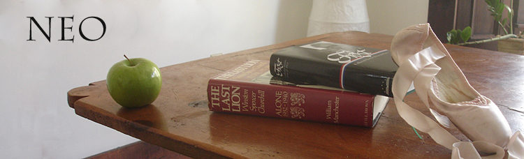
In the image with the apple, books and ballet slipper, I prefer the old font for “NEO” over the new one.
Neo: Looking back and forth between here and and the new format again this morning, I’ve got to second this comment by “Julie near Chicago” (at 6:07 PM yesterday):
“The beige sidebar here adds clarity and composition.”
With all the fussing about line length and font sizes — all good and worth fixing — let me just say that the overall look of the new blog is great. Clean, wide, fresh, more modern, more inviting. Love it!
Mrs Whatsit:
Thanks!